Seattle University
Print design; Pre-press; Quality assurance
The lead generation program that we conducted with Seattle University over the span of nearly 10 years included not only email campaigns. We also created print collateral to reinforce the messaging as well as reach the adult decision influencers of prospective students. Print pieces were often a more reliable way to communicate with prospective students' parents/guardians. Using historical data trends and predictive modeling, we often targeted these more expensive print mailings at audiences with higher likelihoods of engagement or enrollment.
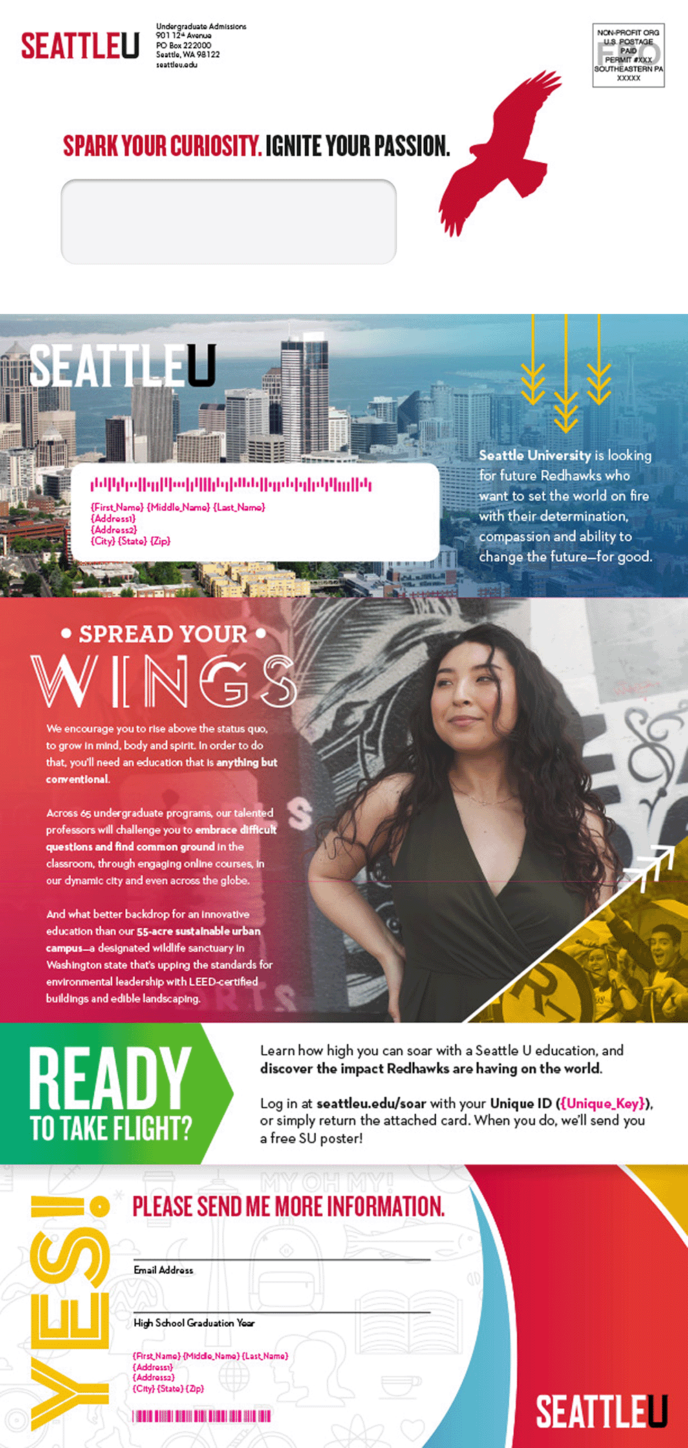
Each campaign involved an initial print mailing (below) and a fulfillment piece (right) that would be sent to students who had completed the interest form.
When drafting the initial mailing, Seattle opted to go with a traditional letter with a #10 window envelope. We didn't want the letter to just be a straightforward letter though and waste this opportunity to reinforce their brand. So I designed a letter that felt more like a one-page marketing piece with an attached business reply card. As with all uncoated paper stocks, we had to address the printing to manage ink absorption and drying concerns. We addressed this by a careful attention to ink limits and image brightness to ensure that we minimized bleeding.
The fulfillment print was a fold-out brochure with a poster on the other side. We had been doing posters with Seattle since the beginning of our work with them. This was always a great opportunity to add some flair to the campaigns.


find me here »
